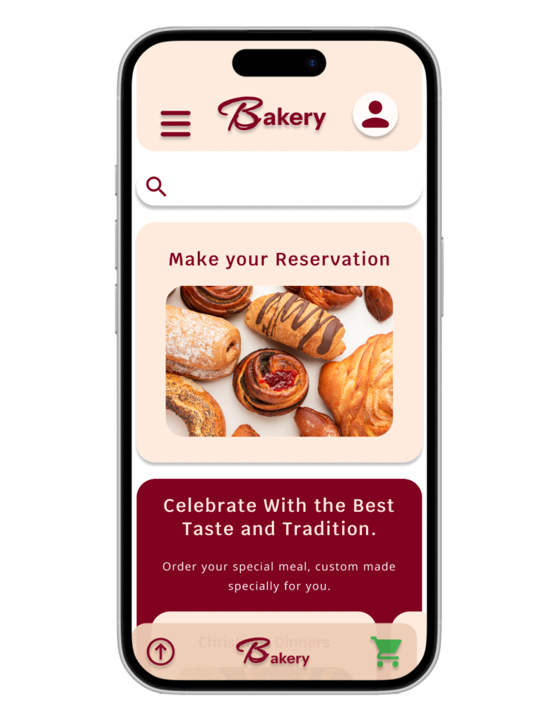
As part of Google’s UX Design course, I developed my first prototype:
The Bakery App!
Designed to make ordering and pickups easier for users while supporting local businesses. I combined my knowledge of strategic planning, design, and coding, while tapping into my creativity and observation skills. I also learned how to transform people’s problems into thoughtful, impactful design solutions.
The Bakery App
First High Fidelity prototype created as part of the UX Research and Design Course from Google.
The Case
Living in Barcelona, I’ve seen century-old stores close, unable to compete with big companies and the rise of online shopping. I realized that supporting them wasn’t always easy. Lines were often long, products sometimes sold out, and the experience could be frustrating despite the charm of these traditional shops.
Challenge: Design a simple, user-friendly app that anyone can manage. The app should showcase products and provide options for ordering, including reservations and in-store pickup.
The User
Roberto, a retired man, likes to buy fresh bread every day at the same time but needs to pre-order because he can’t wait in line.
Melany, a young mother, needs to buy a special cake for her daughter but doesn’t have time to go to the store because she’s busy.
Mercé is a Bakery owner that needs to increase the profit, organising the sales, productions and getting more clients.
Persona

Merce
<span data-metadata="">76 years Old
Completed degree.
Lives with her Husband, and have 5 grandchildren, a son and a daughter.
“Very professional, grandmother, mother and businesswoman.”
The bakery, a family legacy for over 100 years, is struggling to keep up with modern times and meet sales needed for expenses.
Objectives:
- Generate income from her family’s traditional bakery.
- Increase sales through innovation or online advertising.
- Strengthen the brand’s identity.
- Effectively promote her products.
Frustractions:
- Declining sales.
- Overwhelmed by too many customers at once.
- Rising rent, creating fear of losing the store.
Problem: Owner of a traditional neighborhood cake shop wants to boost the sales of the products and survive the high rent prices.
Pain Points:
1
Many customers at the same time
2
Difficulty to boost new season products
3
Unsold products often go to waste
4
Losing Customers to Larger Stores
User Journey
Actions:
Determine:
Types of products to sell.
Production quantity.
Sales methods: Pre-order or in-store.
Set deadlines.
Special advertising to promote the season kits.
Task List:
Determine kit size and production timeline.
Advertise in-store and through the app.
Adjust deadlines based on demand.
Refresh store and app decor to promote sales.
Improvement Opportunities:
Build an online presence for promotion.
Provide online ordering and delivery options.
Enhance customer experience and engagement.
Organize production quantities and stock, managing requests through the app.
User Emotions

Fear
Afraid of mistakes

Confident
Optimistic

Questioning
Calculating

Creative
Have New Ideas

Ansiety
All at the same time
Ms. Mercé: The Bakery Owner’s Thoughts and Dilemma
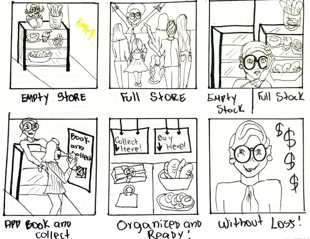
Considering Mercé’s persona as a client, we explore her user history and challenges to determine the best path forward.
Goal:
Increase profit.
Make new customers
Opportunities
By analyzing actions and considering user emotions, key opportunities for improvement were identified:
Promote New and Traditional Products:
Highlight a mix of classic and new offerings to attract both loyal and new customers.
Pre-orders for Stock Management:
Utilize pre-orders to better organize inventory and production, reducing waste and preventing stockouts.
Integrated Marketing:
Leverage both in-store and online marketing to promote special products and reach a wider audience.
Online Ordering with Pickup:
Offer online orders with in-store pickup to streamline operations and appeal to younger customers.
Start the Design
The Bakery App should address the needs of the bakery owner and their clients, who use the app for different purposes. It must offer a variety of products, have a clean shape, and be easy to manage.
Solution:
Create an intuitive bakery app with the following features:
- Simple Interface: A clean, uncluttered design with clear categories for products, making navigation easy for all users, regardless of technical expertise.
- Product Showcase: High-quality images and detailed descriptions of bakery items, with filters for categories like bread, cakes, or pastries.
- Ordering Options:
- Reservation System: Allow users to reserve specific items in advance, ensuring availability.
- Pickup Scheduling: Enable users to choose a convenient pickup time to avoid lines.
- User Management: A lightweight account system to save preferences, past orders, and pickup times, making repeat orders quick and seamless.
- Business Dashboard: Provide bakery owners with a simple dashboard to update product availability, track reservations, and manage customer orders.
- Accessibility: Ensure the app is accessible with larger fonts, easy-to-read text, and support for multiple languages.
- Notifications: Send reminders for order pickups and updates on product availability or special deals.
By focusing on simplicity and flexibility, this solution empowers both customers and bakery owners, making traditional products more accessible while streamlining operations.
First Prototype Design
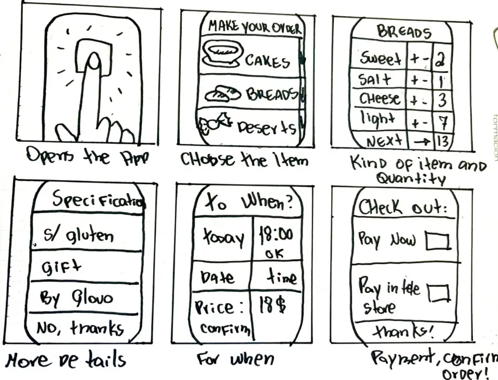
Paper Wireframe
Design, Test & iterate
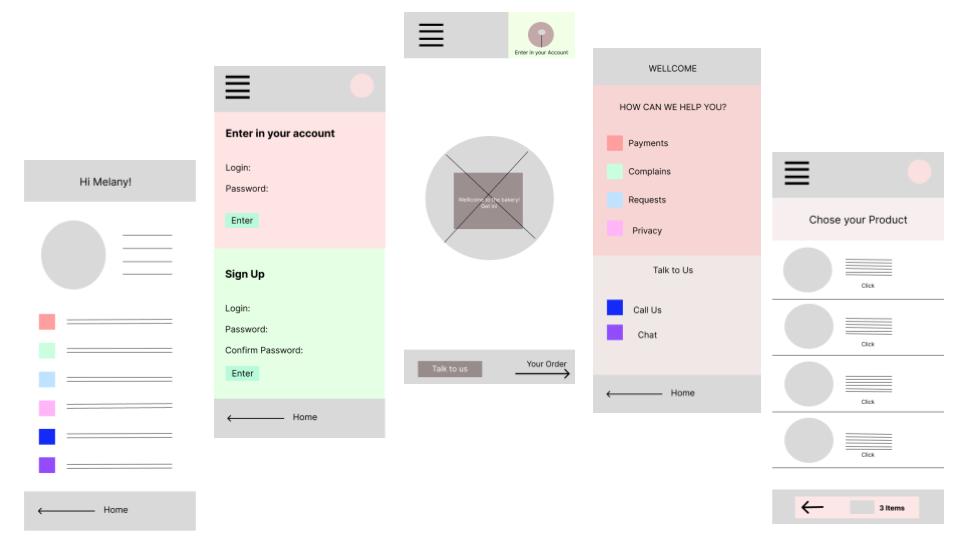
My first free-hand prototype was a set of simple, hand-drawn screens illustrating how the app should function.
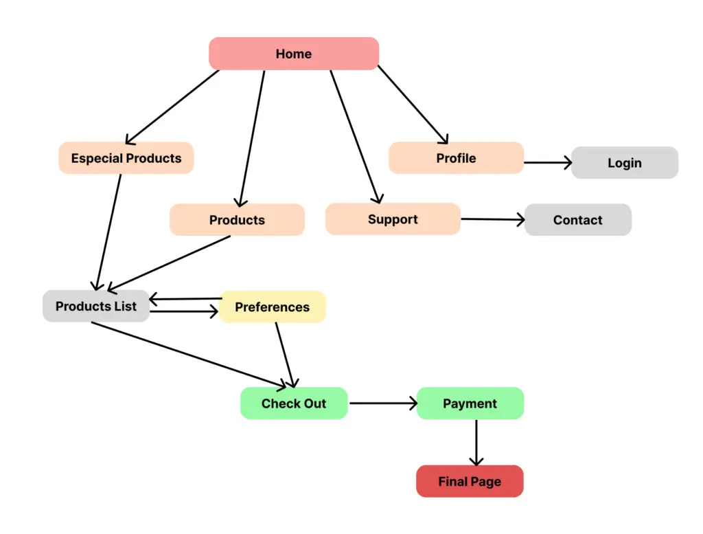
The SiteMap
The sitemap for the bakery app was designed with simplicity and user-friendliness in mind.
Key features:
Product browsing
Online ordering
Delivery scheduling
Account management
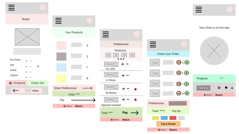
The Digital Wireframes
The wireframe prototype includes:
- Login screen
- Product list
- Order preferences
- Payment details.
- Customer account
- Profile management
- Navigation menu
- Contact support section
The Low-Fidelity Prototype
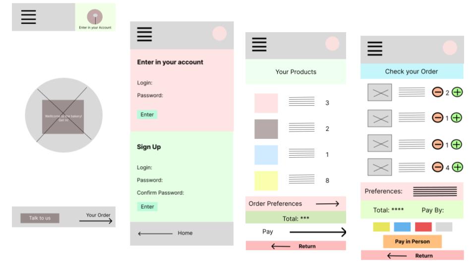
Low-Fidelity Prototype Link:
Research Study Plan
Introduction:
Stakeholders: Bakery Clients
Project Background: Developing a bakery app to streamline production, manage stock, and simplify orders, ensuring timely service and increased sales.
Research Goals: Assess the app’s effectiveness, ease of use, and practicality for users.
Methodology
Type: Unmoderated
Location: Barcelona, Spain (Remote)
Incentive: Participants receive a code for a free product after completing the survey.
Timeline: November and December 2024
Duration: 10 minutes per session
Research Questions:
How long does it take you to place an order?
How often do you think you will use the app instead of visiting the bakery in person?
Are the products displayed clearly enough for you to choose your preferences?
Is the payment process simple and convenient?
What additional features would make you use the app more?
Participants:
Bakery visitors, likely from the local neighborhood.
Ages 18 to 90, with a focus on clients over 50.
Script
Prompt 1:
Profile
How easy was it to create your profile?
Would you add or remove anything from it?
Prompt 2:
Products
Did you find the product you wanted?
Were the pictures clear?
Were the buttons easy to locate?
Prompt 3:
Preferences
Would you like more preference options?
Was it easy to select your preferences?
Prompt 4:
Checkout
Was completing the order simple?
Did you feel safe finalizing the order?
The research also includes a rating question to better understand the user experience.
Participants are asked to score from 1 (strongly disagree) to 5 (strongly agree):
- I will use this app frequently.
- I prefer using the app over visiting the bakery in person.
- The app is easy to use.
- It took me a long time to complete the process.
- I like how the options are displayed.
- It was easy to choose and find my products.
- I enjoy spending time using this app.
- The product selection is complete.
- It was easy to complete the payment.
- I understood the next steps after completing my order.
Key Performance Indicators (KPIs) Results Framework
1. Order Completion Time:
- Metric: Average time taken to complete an order.
- Result Goal: ≤5 minutes for most users.
2. Ease of Use & Preferences:
- Metric: User satisfaction (score 1–5) on app usability and features like product selection, preferences, and navigation.
- Result Goal: Average rating ≥4 for:
- Ease of creating a profile.
- Product clarity and availability.
- Button placement and navigation.
- Preferences customization options.
3. Abandonment Rate:
- Metric: Percentage of users who start but do not complete their order.
- Result Goal: ≤10% abandonment rate.
- Analysis: Identify points where users drop off and refine usability.
4. Engagement Beyond Purchases:
- Metric: Percentage of users browsing or engaging with the app without making a purchase.
- Result Goal: ≥50% of participants explore the app even when not placing an order.
5. Trust & Security Perception:
- Metric: User confidence (score 1–5) in payment safety and completing orders.
- Result Goal: Average rating ≥4 for safety and order clarity.
Conclusion:
With most users completing orders in under 5 minutes.
User satisfaction ratings were strong, averaging 4 or higher for ease of use, product clarity, and customization options.
The abandonment rate stayed below 10%, and 50% of users engaged with the app beyond purchases.
Trust in payment security was also high. Overall, the app shows strong adoption and engagement, with opportunities for further optimization based on user feedback.
The High Fidelity Prototype
After making some initial improvements based on user feedback, we moved forward with developing a high-fidelity prototype. This allowed us to thoroughly test its functionality, assess user interactions, and identify additional areas where we could make further enhancements for a more seamless experience.
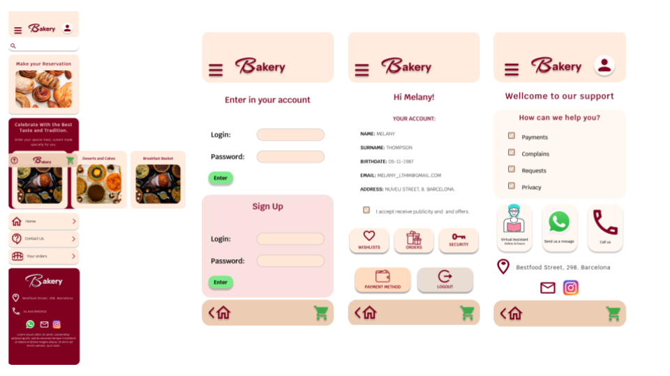
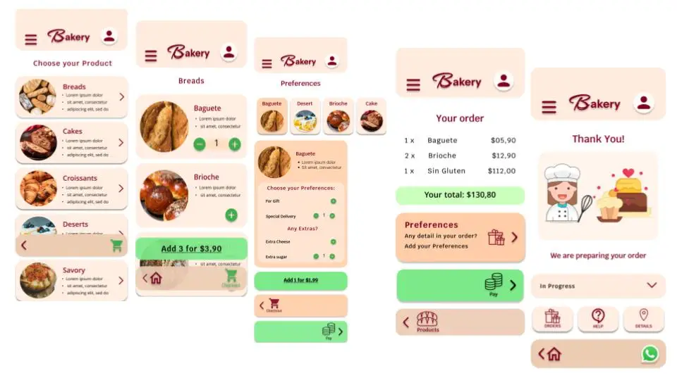
Before finalizing the prototype, we conducted a user research session using a moderated methodology. This phase focused on testing the last functional details of the Bakery App to ensure its effectiveness and gather valuable insights for any final adjustments.
The 2º User Research
Methodology
Type: Moderated
Incentive: Participants receive a code for a special gift after completing the survey.
Duration: 10 minutes per session
Participants:
20 Bakery clients and volunteers, likely from the local neighborhood.
Ages Half Over 50, half between 18 and 49.
Research Questions:
- How do users behave and feel while completing an order through the app?
- How well do users follow the steps to complete an order?
- What aspects of the app could be improved?
- Was it easy to complete the order through the app instead of going to the store?
- How simple was it to find the products?
- Was the payment process easy and straightforward?
Research Findings
During the research, we observed that Most Part of the Participants:
Successfully:

Got started with the app.
Accessed and updated their profile details.
Navigated the menu with ease.
Located and selected products.
Adjusted quantities.
Found the checkout process and payment options quick and straightforward.
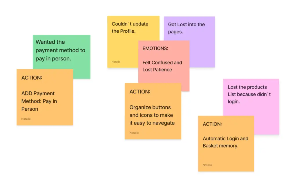
Had Difficulty

Got Lost into the pages.
Couldn`t update the Profile.
Wanted the payment method to pay in person.
Lost the List because didn`t login.
Felt Positive

Had a positive voice tone
Was confident
Bad Emotions

Felt confused between the pages.
Lost patience looking for the payment method.
Tasks
Create Password
Users struggled to find where to create a new password.
Add a button below the profile section for easier access.
Find the Products
Display products in a categorized list, allowing users to browse easily without getting lost.
Update Profile
Add an ‘Update Profile’ button prominently on the user dashboard for easy access.
Lost in the Pages
Ensure the ‘Back’ button is visible on all pages for seamless navigation.
Products Lists
Secure the product list and include a login option at the end of the ordering process.
Conclusion:
The users expressed a strong preference for an option to pay in person.
Navigation challenges were observed, with users feeling lost between pages and content.
They also highlighted the need for flexibility by allowing orders to be completed with or without logging in.
Additionally, saving the product list for future orders was identified as an essential feature to enhance user convenience.
The Design
Visual Design and Color Psychology
In visual design, colors play a vital role in communication, evoking emotions and subconscious psychological reactions.
In the Bakery App, the color palette must align with the brand identity while inspiring feelings associated with warmth, tradition, and emotions that bakeries naturally evoke.
The Bakery's Brand Identity
Dark Red/ Burgundy: Symbolizes desire and energy, creating a sense of passion and connection.
Bread Paper Tones (Beige/Pastel/Brown Variations): Evokes sophistication and familiarity, reminiscent of classic bakery packaging.
The App's Design
The app incorporates these colors with a functional and emotional approach:
Orange: Adds warmth and friendliness, inviting users to engage.
Black: Provides clarity for text and essential content.
Green: Highlights confirmation buttons, symbolizing action and success.
White: Ensures contrast and a clean, spacious interface for a modern feel.
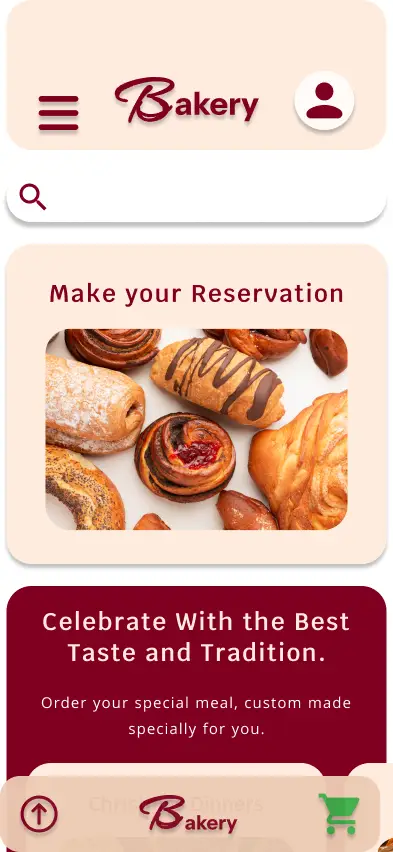
Prototype
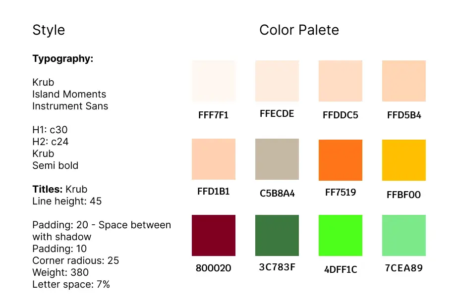
Design System
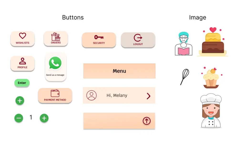
The design system for the Bakery App was created step by step, adding each element like icons, colors, typography, and buttons. It became the backbone of the app’s visual identity, ensuring consistency and making updates easier as the design evolved. This approach kept everything organized and cohesive throughout the process.
Final Product
The Bakery App is my first project from the Google UX Design course, and it holds a special place in my journey as a designer.
This app is designed to address the challenges faced by local bakeries while making the shopping experience effortless for customers. Throughout this project, I focused on creating an intuitive and enjoyable experience, ensuring the app could truly meet the needs of both the bakery and its customers.
Working on this prototype taught me so much about strategic design, user research, and turning ideas into practical solutions. It’s been an incredible journey, from sketches to wireframes, to testing and refining. I’ve learned to value user feedback, embrace creativity, and transform real-world problems into impactful designs.
As I present this final prototype, I feel a sense of accomplishment and gratitude for this learning experience. This is just the beginning of my journey as a UX Designer, and I’m excited for what’s to come.
The Web Version
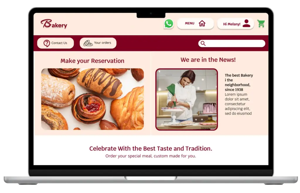
The web version of the bakery app enhances accessibility, enabling customers to browse, order, and manage preferences from any device. While maintaining the intuitive interface of the mobile app, it also offers additional features such as expanded space for contact information, bakery images, and a forum to foster customer connection beyond placing orders.
Click to see the Prototype:
Many Thanks!


